Blackbird
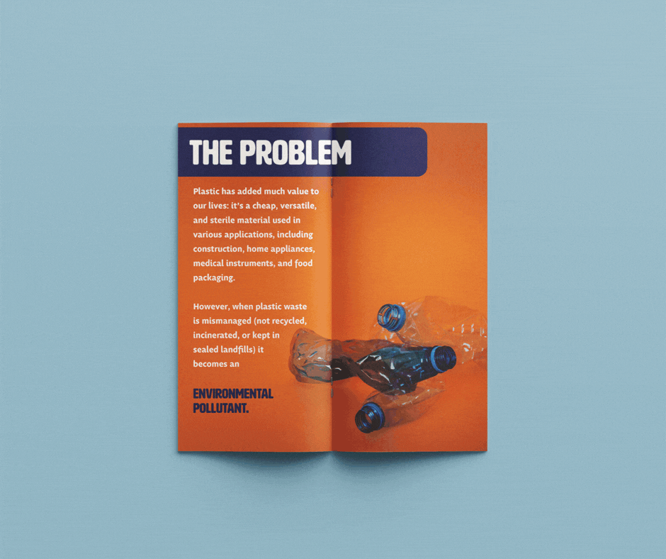
Blackbird is a conceptual organization dedicated to finding a unique solution to the world’s plastic problem. By collecting, shredding, and melting plastic that would otherwise be discarded, and recycling it into usable material, Blackbird is able to save hundreds of thousands of pounds of plastic from the landfill. They are not only earth-conscious, but community driven as well; because of this, the plastic that is recycled goes on to become benches, bus stops, and other infrastructure that serves the communities that we call home.
Blackbird's marketing goals are to create marketing that is unlike that of any other recycling initiative, to match their one-of-a-kind recycling model. They are focused not only on advertising their organization, but utilizing their marketing to spotlight the polution problem as whole.
With all of this in mind, I selected a series of bright and contrasting colors that would be able to stand out in any environment, even a dim subway. The name “Blackbird” is in reference to the way Blackbirds make their nests out of trash they find on the street; this is exemplary of the way the company is not only keeping non degradable plastic safe from being mismanaged, but also repurposing it into
something beneficial for the community. The Blackbird mascot serves to drive that point home, and add an endearing, memorable face to the plastic recycling movement.
Animated Logo

Brand language

Poster design


